In the Beginning – the Control Panel
Control rooms date back to the earliest days of manufacturing plants. By the 1930s – 1940s, it was typical to have a small separate room near the process where most of the instruments (typically pneumatic) were grouped. Control panel arrangements received a lot of thought, and instruments were logically grouped. Sometimes a pictorial representation of the plant was used as a background onto which the instruments were placed in their appropriate positions. Many readings were represented on paper strip-chart or circular chart recorders. Alarms consisted of separate “lightbox” annunciator panels.
Such installations had many advantages. The process condition could be determined at a glance. Trends of important readings were always in view – all the operator had to do was look at them. The alarms were carefully selected and various different upsets would often produce repeatable patterns on the annunciator, besides the individual alarm indications. With a simple walk through the control room, experienced operators, engineers, and managers could quickly see the overall state and health of the process – it was easy to get “the big picture.” These “control walls” persisted into the 1960s and 1970s, although stand-alone electronic instruments began to replace pneumatics.
There were many disadvantages with this arrangement as well. The addition of new instruments or alarms might require moving several other instruments to keep a logical arrangement. This was expensive, and thus often was not followed, leading the logical pictorial arrangement to become out-of-date over time. Pneumatic instruments were difficult to combine into complex or advanced control schemes. The instruments took up a lot of room, and the space behind the panel was often a dirty, cramped maze of tubing and wiring. Communication of the control system to “anything else” was generally impractical.

A Typical Pre-DCS Control Panel
The Arrival of the Distributed Control System (DCS)
The frustrations associated with the Control Panel were addressed with the arrival of the Distributed Control System (DCS), in which process signals were monitored by a computerized structure and physical instruments were replaced with software displays. The business advantages of a DCS are huge! It is easy to reconfigure control strategies and programmatically alter the behavior of the system. In addition, almost everything in the system is changeable without much trouble. (The astute reader will also realize that the ease of such changes is also the source of major problem areas in administering a DCS!)
So, over a couple of decades, DCSs have predominated and most older-style control systems have been converted. The advantages of a DCS have far outweighed some well known DCS deficiencies, such as dealing with the thousands of alarms the systems are able to generate (See Appendix 4).
The earliest DCS implementations did not have “custom graphics.” Instruments and readings were displayed in “group displays.” Shown in Figure 2-2 is a group display in which 8 separate control elements are shown. (The actual display has a black background and colored text, which does not print well in a book, so the figure is reversed.) Hundreds of these groups would be configured to display all of the controls and measurements available to the operator. The issues around black display backgrounds will be discussed later in the book.

A Typical Pre-Graphic “Group” Display
The CRT-display workstations used to display these groups were expensive – around $50,000 each in the 1970-80s! Thus systems were installed with the minimum possible number of such screens and the operator’s “big picture” view of the process collapsed to a “peek through the keyhole” view. With the big picture gone, the practice began of configuring more and more alarms. The alarms notified the operator about changing conditions “outside their keyhole” which used to be able to be seen at a glance. The DCS made this quite easy – alarms were “free” and could be created with a few keystrokes. A single operating position had about 50 alarms in the control panel days; the typical DCS operating position is now configured with over 3,000! This is the origin of the DCS Alarm Management problem.
DCSs quickly evolved to allowing for the creation of custom graphics. A schematic-type picture could be built showing process vessels, piping, equipment, and live process values. A limited palette of colors and intensities was available for use (and misuse). Screen elements could be built to change shape, color, or functionality based on process values. Trends could be created and displayed.
However, as in so many things, our ability to design and create new products and capabilities works much faster than our ability to understand how to use them effectively. With little research or guidelines as to how to effectively design and use a screen-based control display, engineers and operators (with the best of intentions) implemented whatever they thought was good – or at least usable.
Resistance and Inertia
It is interesting to note there was typically very high resistance on the part of the operators in changing from “groups” to “graphics.” For all of their deficiencies, operators were familiar with using the group displays and had adapted to run with them. Groups typically display faster than graphics and operators often have the access codes to the groups memorized. This same phenomenon of resistance has been and will be experienced when changing from whatever type of graphics are currently in use to the high-performance graphics as described in this book. Expect it.
Early and Current HMIs
The most common use of the initial DCS graphics capability was simple and straightforward. A P&ID-like depiction of the process was created and live process values were “sprinkled” all over it. While easy to create, this is not very effective. Even given 20+ years of significant advance in DCS display capabilities, the vast majority of all operator graphics follow this paradigm and have improved little since the 1980s in real capability and effectiveness. However, now the colors used may be more varied, the process vessels rendered in 3-D shading and animated flames used to represent burners – all of which are counterproductive, poor practices.
DCS vendors have now provided the capability of creating HMIs with extremely high sophistication, power, and usefulness. Unfortunately, this capability is usually unused, misused, or abused. The basic principles of effective displays are often not known or followed. Large amounts of process data are provided on graphics, but little information. Information is “data in context made useful.” In many cases, the DCS buyer will proceed to design and implement graphics based on the flashy examples (Figure 2-3) created to sell the systems – unaware from a usability and effectiveness point of view, they are terrible. Such graphics contain:
equipment depiction with excessive, distracting detail.
hard-to-read numbers and status information.
inconsistent process flow and navigation.
poor and inconsistent color choices.
a lack of hierarchical content (the progressive display of detail).
an almost total lack of trend or status information.
improper alarm depiction.
a lack of display methodologies showing the operator the state of the process compared to the desired conditions.
One DCS vendor has actually advocated taking a digital photograph of different parts of your process, using it as a display background, then adding “live values” of flow, pressure, and temperature on top of it. There could actually be few worse displays for operating a process than this idea.
Here is a quote from the website of a popular vendor of HMI software tools. It notes they include with their software a “comprehensive library of pre-built, eye-popping graphical symbols and faceplates.” “Eye-popping” is exactly what is not desired!
HMI-Related Problems Arise
There have been multiple examples of major industrial accidents where a poor HMI was cited as a contributing factor. The 1994 Texaco Pembroke (UK) explosion is one of the well-researched and most cited cases. In this event, overflow of flammables into a flare header not designed for liquids led to a rupture and vapor cloud explosion. The HMI-related contributory factors were determined to be improper alarm management and the lack of the DCS HMI to provide the operators with an overview of the process conditions. It was determined the displays provided were inadequately designed and configured to help operators control the process. Had a proper overview display been provided depicting volumetric or mass balance information, the accident might well have been avoided.
In an eerily similar accident 21 years later, the BP Amoco Texas City plant overfilled a tower for many hours, and then overflowed flammables from it to a blowdown drum, and from there to the ground, causing a vapor cloud and explosion that killed 15 people and injured many more. There were both alarm-related and HMI-related contributory factors. Once again, there was no overview display allowing for a proper depiction of the state of the process. The existing displays did not provide volumetric or mass balance information which would have clearly indicated the situation.
This problem is not unique to the process industries. In the 1980s, the software user interface (the HMI) of the Therac-25 radiation therapy machine was implicated in several patient deaths due to radiation overdose. There have been more recent medical journal reports documenting how poorly-designed HMIs for specifying and ordering medicine have contributed to the death of patients. That’s something to think about the next time you are in the hospital.
How Did This Happen?
Why are industrial HMIs implemented so poorly? This situation came about mainly as a result of two factors: knowledge and money. Early DCSs had limited graphics capability. When panel instruments were migrated to a DCS, funding for the graphic development was often not included (or minimized) in the overall funding for the conversion project. When it was included, often the system integrator had little expertise or experience in graphics. Late in the project (with funds running out), the issue had to be addressed:
Typical DCS Conversion Project Manager circa 1985-1995: “Graphics? You mean pictures? You want pictures of the process on these fancy screens? Don’t you know we only have a few weeks until cutover? Hmmm – what do we have laying around here…OK! See that stack of P&IDs? Those are pictures, right? Use them and get it done quickly and don’t bother me about this anymore. I’ve got a budget review meeting.”
The unfortunate thing is P&IDs are tools for designing a process which is a very different thing than a user interface for controlling a process. Yet the fact they look like pictures and were convenient, began the current, widespread paradigm that an HMI should look like a P&ID with “live values” sprinkled on it. It is “the easy way out.”
Without specific funding or guidance, the graphics were developed in a variety of ways. In many cases, it was left to the production department to take care of the HMI. Sometimes the engineers did them, who, even with the best of intentions, were not knowledgeable in effective graphic design. Knowledgeable guidelines were not available.
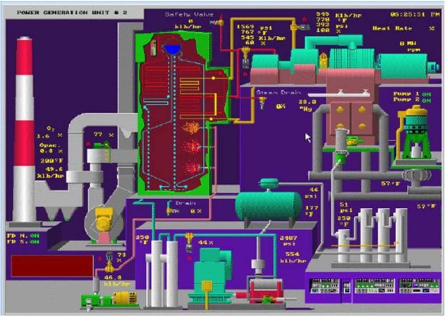
Figure 2-3: A typical vendor graphic more appropriate for selling systems than operating a process! Luckily you are spared the animation…
It was also very common to deal with the problem by saying, “Lets make the operators responsible for doing the graphics. After all, they’ll be using them.” Then, an operator would be chosen for the job and sent to a DCS graphic training class. (While the DCS manufacturer could certainly teach how to create graphics on their system, this did not mean they knew or taught how to create effective graphics.) The frequent result was what we like to refer to as a “Chapter 3 Graphics Implementation.” That is, the operator would then create the graphics using the techniques and information covered in the DCS graphics building manual up to about chapter three. More complex or advanced techniques went unused. The emphasis would be on display of values, perhaps some condition-based colors, but certainly not of such desirable things as embedded trends.
In some cases, a third party integrator or engineering firm might be charged with creating the graphics as part of a large upgrade. The tendency would be to economically (for them) reuse the simplistic practices of past projects.
With few reference works available on the subject, and the lack of a comprehensive HMI Philosophy with a Style Guide, the resulting graphics would (in hindsight) embody many of what we now know to be poor practices and inconsistencies.
Over the ensuing years, DCS hardware and software upgrades would be released, greatly enhancing the potential graphic capabilities. However, when these enhancements would be issued, the DCS owner would already have a large existing inventory of graphics “everyone was used to.” The reaction to DCS upgrades was usually not “Great! Now we can redo our HMI, and add embedded auto-ranging trends and multi-state conditional elements!” No, it was instead, “Do you have a migration utility to convert my existing graphics so they will continue to work unchanged in the new system?” Often, there has not been enough time, money, and knowledge to properly take advantage of advanced graphic capabilities in the real-world industrial environment.
Do It Yourself
We would think it strange if Boeing sold jetliners with empty cockpits, devoid of instruments logically and consistently arranged for use by the pilot. Imagine if they suggested, “Just get your pilots together and let them design their own panel. After all, they’ll be using it.”
Imagine if your car came with a blank display screen and a manual on how to create lines, colors, and shapes so you could build your own speedometer. While this might actually appeal to the technical audience of this book, the rest of the world would think it strange and unacceptable. And, could you operate your car by using the “Doom” display motif created by your teenage son?
This do-it-yourself approach, without consistent guidance, is the general case with industrial graphics and is a major reason the results are often poorly conceived, inconsistent, and generally of low quality and performance.
The Answer to the Problem
This book contains detailed information for the design, implementation, and maintenance of a High Performance HMI. The solution involves understanding:
Principles and best practices for an effective HMI
Proper display hierarchy, content, and navigation
Level 1 process overview displays
Level 2 process control displays
Level 3 process detail displays
Level 4 process support and diagnostic displays
Effective operator console design
The creation of a High Performance HMI is accomplished using a straightforward, seven step methodology. In later chapters, each step will be discussed in detail.
Step 1: Adopt a high performance HMI philosophy and style guide
Step 2: Assess and benchmark existing graphics against the HMI philosophy
Step 3: Determine specific performance and goal objectives for the control of the process, for all modes of operation
Step 4: Perform task analysis to determine the control manipulations needed to achieve the performance and goal objectives
Step 5: Design high performance graphics, using the design principles in the HMI philosophy and elements from the style guide to address the identified tasks
Step 6: Install, commission, and provide training on the new HMI
Step 7: Control, maintain, and periodically reassess the HMI performance
Conclusion
| The Bad News | The Good News |
| Sophisticated, capable, computer-based control systems are operated via poorly functioning HMIs designed with inadequate knowledge. | The functionality and effectiveness of these systems can be greatly enhanced if some redesign in accordance with proper principles is made. A High Performance HMI is practical and achievable. |
Disturbing Moments in Cinematic Human-Machine Interfacing:
NORAD Computer to unaware teenage hacker:
“Would you like to play a game?” <displays list>
David: “Sure. How about Global Thermonuclear War?”
Wargames